
Barhop Buddy
A travel and review app designed to guide newcomers through Philadelphia's vibrant nightlife & downtown entertainment.
Role
UI/UX Designer, Branding
01. Discover & Define
Initial Thinking
Target Users
Introverts looking to work their way into the bar scene
Travelers unfamiliar with Philadelphia nightlife
Research Methods
Existing Systems
Quantitative research (survey)
Qualitative research (user testing)
Requirements
Product
This app is for exploring Philadelphia’s nightlife and leaving reviews.
Users can explore areas based on location, leave detailed reviews on crowds and noise, and create custom collections.
User
Primary User: A person interested in city bars and venues between the ages of 21-35.
Satisfying travel information, reviews, and itinerary creation.
Technical
Designed for mobile app usage across multiple screen sizes.
Business
Competitors: Trip Advisor, Rotten Tomatoes
To stand out, Barhop Buddy asks for reviews on crowds and noises in locations. The app also contains a fun, engaging bunny mascot.
Competitive Analysis
Trip Advisor
Strengths
Brand Recognition
User-Generated Content
Diverse Offerings
Weaknesses
Dependence on User-Generated Content
Overwhelming UI
Opportunities
Mobile Experience
New Travel Services
Feed Personalization
Threats
Economic Changes
Global Events
Bots and Fake Reviews
Rotten Tomatoes
Strengths
Brand Recognition
Large Database
Screen Accessibility
Weaknesses
Strong Bias
Negative Reviews
Spam Content
Opportunities
Content Generation
Feed Personalization
Threats
Changes in Media
Regulatory Issues
100%
Bars, Events, & More
All survey participants supported the idea of expanding the app beyond traditional bars. They expressed interest in including nighttime venues and activities featuring a bar. Additional comments were left, noting how this would make for a less intimidating experience.
85%
Filters Please!
Eighty-five percent of survey participants expressed a strong desire for a detailed filtration and categorization system.
User Personas
Persona 1: Nayah Haynes
20 years old | Undergraduate Student | Friendly, Creative

User Statement: “I’d like an experience that helps me learn about and find bars that fit my wants for a fun 21st birthday celebration!”
Pain Points
No knowledge of bars or drinks
Wants to find a younger crowd
End Goal
Be able to find an exciting downtown bar with other college students
Persona 2: Chris Parella
29 years old | Operations Analyst | Reserved, Critical
User Statement: “I’d like an experience that provides a personalized itinerary to help me explore Philadelphia's nightlife for the first time.”

Pain Points
Visiting from New York
Doesn’t like loud music or tight spots
End Goal
Find at least 4 bars to check out
during his trip that cater to his needs
User Journeys
Detailed user journeys/flows were created to show the process of completing a search, save, and review task from both a user who found a website advertising the app and a user who already has an account with Barhop Buddy.
Journey 1.1: Searching For a Bar and Saving to a Collection
Journey 1.2: Searching For Bar Through Map (With Filters)
Journey 2: Reviewing a Bar
02. Explore & Ideate
Low-Fidelity Wireframes
Journey 1.1: Searching For and Saving a Bar to a Collection

Notes: Survey responses revealed that many users felt overwhelmed by typical travel and review app interfaces. To address this, the explore and bar pages were designed with simple, clearly labeled navigation (ratings, categories, hours, etc). Users also expressed a need for a location list specific to Philadelphia and the ability to categorize places for custom itineraries, which directly informed the layout and quick save feature, located on both the homepage and within the more detailed location page.
Journey 2: Reviewing a Bar
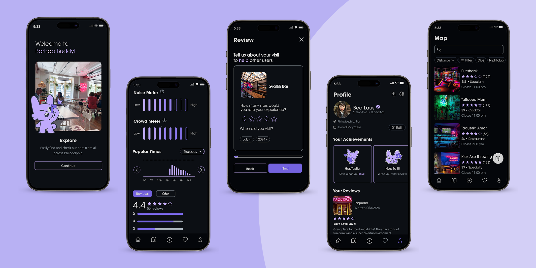
Notes: Survey responses revealed that many users felt apprehensive trusting other travel and review apps due to their lack of reviews and clarity on location specific details, such as crowds, noise levels, and overall atmospheres. This led to barhop prioritizing reviews specific to these features, which introduced mandatory noise and crowd meters before written reviews.
Journey 1.2: Searching For Bar Through Map (With Filters)

Notes: Interviews revealed that users prefer a more versatile map experience, such as being able to filter specific types of bars in their areas and search keywords without having to navigate to a separate search page. This creates a more visually navigable experience, catering to a larger explorative audience.
User Testing
User tests were conducted for each prototype. I broke down each case into a summarized problem and solution.
Improved Visual Layout
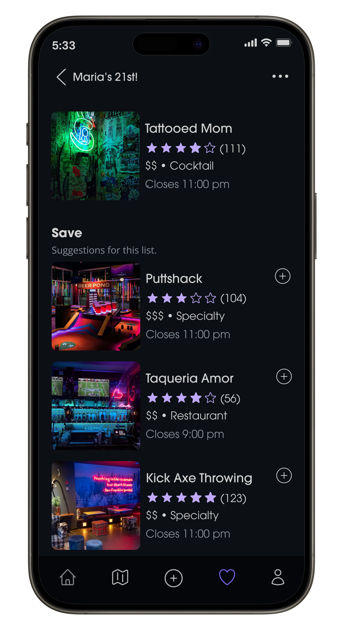
Necessary information was put below every bar page, highlighting every bar’s name, highlighted tags, price range, type of bar, rating between 1-5 stars, and closing hour.
This change allowed users to quickly be able to select bars based on their preference, without having to click in and out of multiple pages to find basic information.
Unclear Hierarchy
Users had difficulty navigating when key information was placed inside the container rather than below it.
Users responded more quickly when the information was positioned beneath the page buttons and images.
Streamlined Navigation and Filter
The page was redesigned as “Saved,” with a vertical scroll layout for easier browsing. A filter button was introduced to streamline navigation, and a “Create Collection” feature was added to help users organize saved items into themed lists or custom itineraries.
Cluttered Saved Page
Users struggled to navigate the original “Wishlist” page due to its horizontal scroll and lack of filtering options. As more bars were saved, the interface became cluttered, requiring too much scrolling to locate specific items.
Visual Identity
UI Design


Final Prototype
04. Final Reflection
Project Takeaways
Communication with Testers
Interviewing and user testing takeaways were beneficial in each stage of the process. Due to the specific target audience and range on the introversion spectrum, this consistent communication provided insight into every possible outlook and experience and helped shape the app’s design.
Research and Competitors
Designing a prototype for a navigation-centered app required detailed research on locations around the city and their available information. Spending extensive time on travel app analyses and businesses downtown made prototyping and designing map-based features smoother.
Gamification
The project began with a goal to include a gamified feature to build an audience, and while the initial direction of a more literal game changed, the decision to design an achievement system attached to the mascot and bunny branding became a fun way to make the app more interactive and stand out from its competitors.
Final Notes *
This project underwent various design changes and involved thorough research and user testing to reach its full potential. It showcases my aim to demonstrate high-level experiences and visions for an app.
Given more time, I would like to flesh out the events feature of the app. How could the app update current events on a daily or weekly basis? Who would they have to partner with to achieve this?